I will explain how to add a shadow effect to text written in HTML using CSS.
text-shadow: 2px 2px 5px red;
text-sahdow: (horizontal shadow) (vertical shadow) (blur effect) (color);
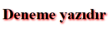
As stated above, we can apply the shadow effect as we wish. We also use - to reverse the effect of the shadow. For example;
text-shadow: -2px 2px 5px red;
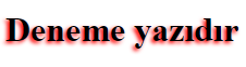
If you wish, you can completely remove the blur effect here. You don’t have to write 0px for this.